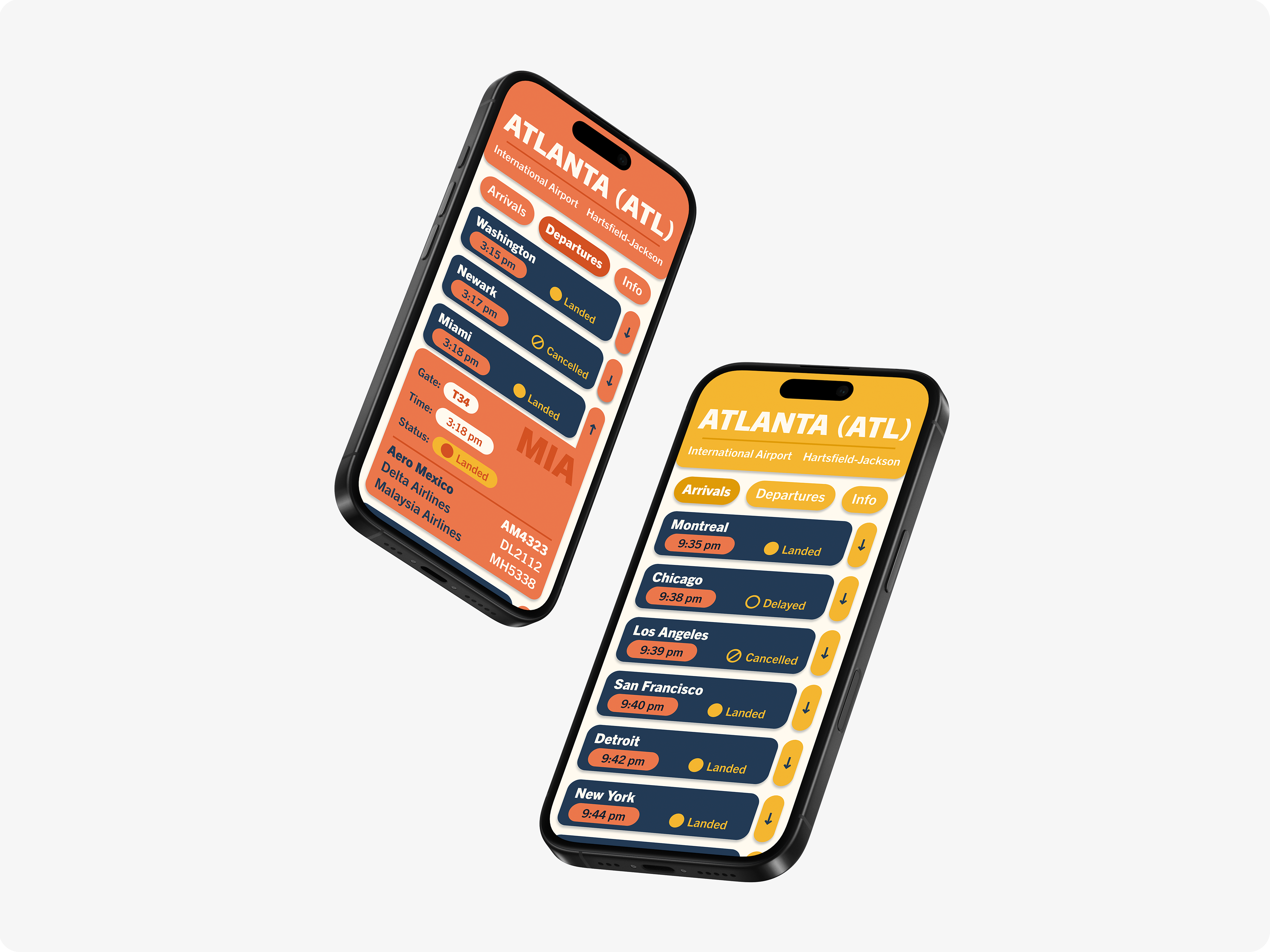
Airline Interface
Objective
Develop an accessible, stress-free flight information interface and typographic system for Atlanta International Airport for new and less experienced travelers.
Deliverable
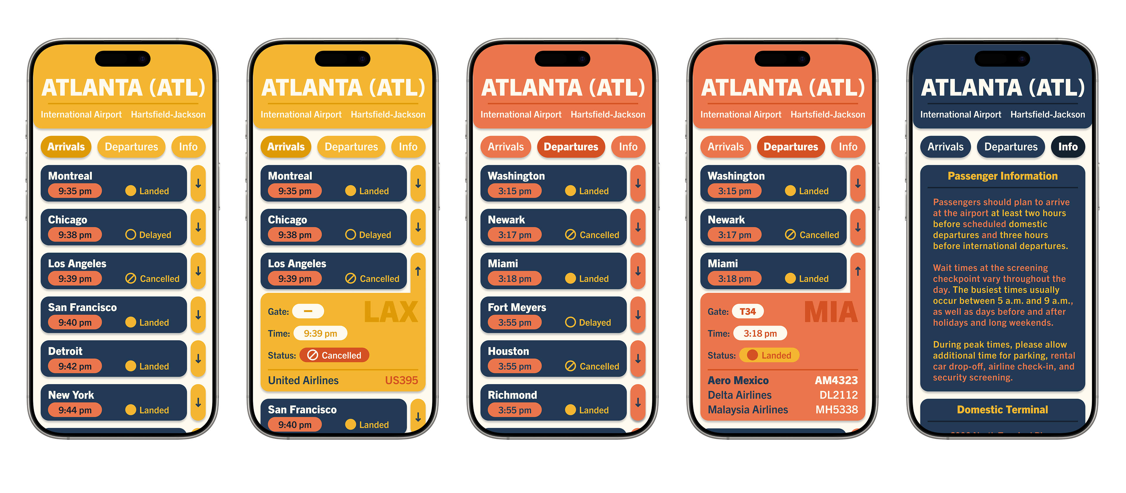
The goal is to create an interface for an iPhone 16 screen with an arrivals, departures, detailed flight information, and passenger information view.
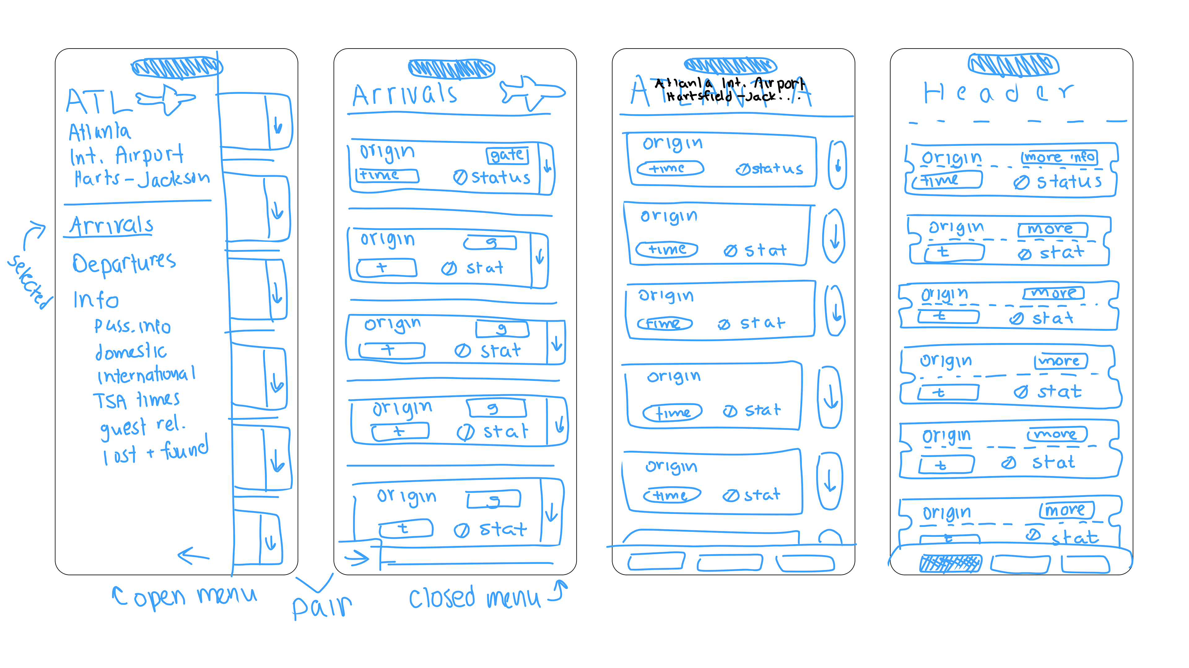
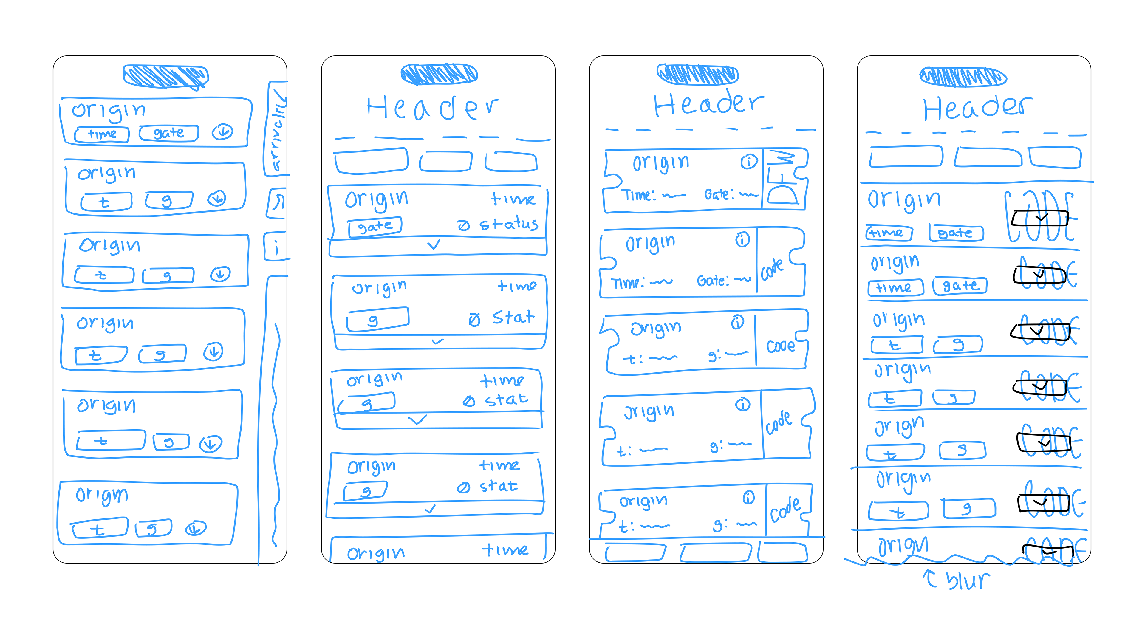
Concept Sketches
The first step after looking for benchmarks was to sketch icons and atomic pieces and different concepts for the interface design.
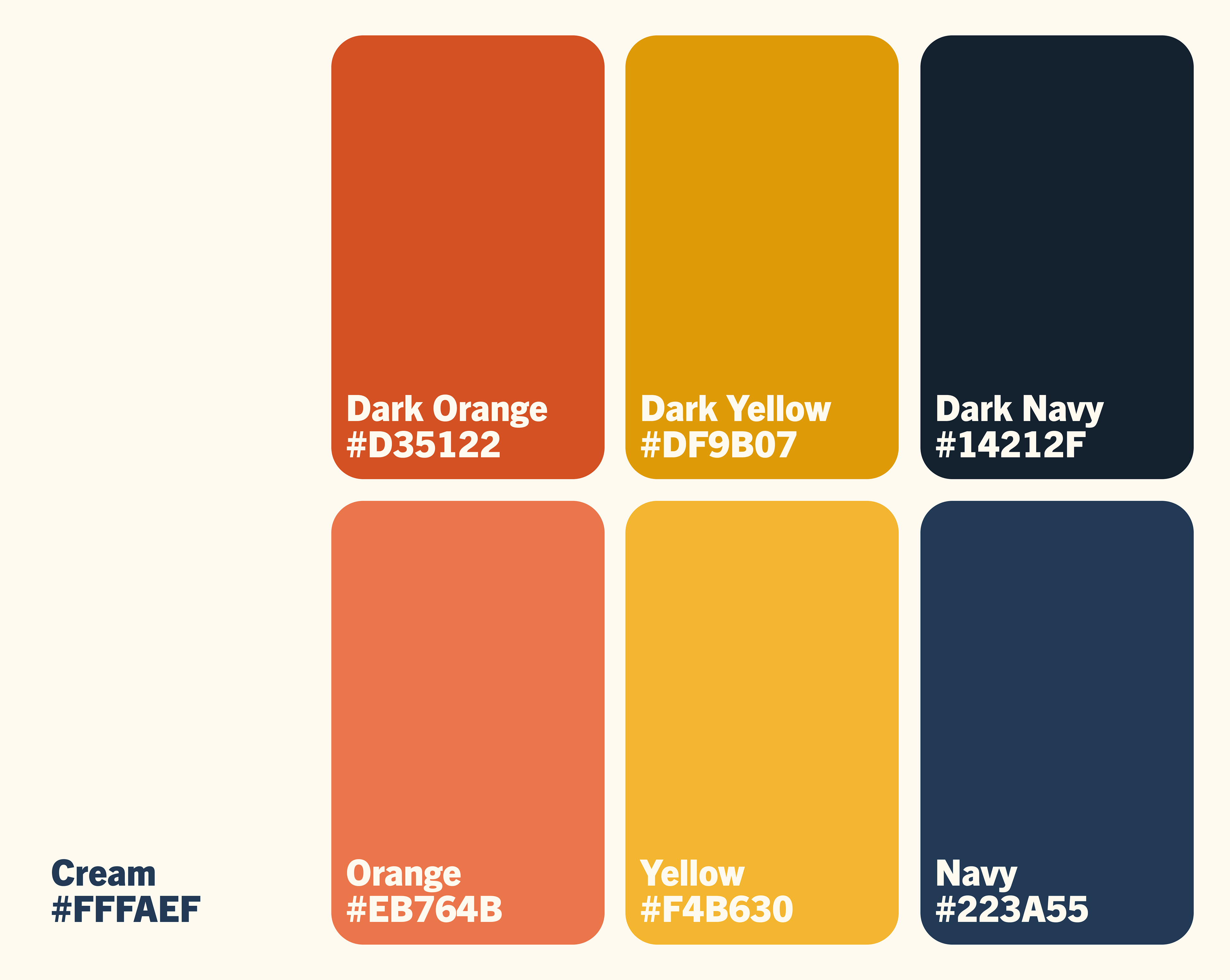
Typeface & Color Studies
Trade Gothic Next was designed as a versatile, comprehensive, and cohesive sans serif typeface. A grotesque style with varied widths that are good for layout design.
This typeface was chosen for its simplicity and readability in bolder weights, with a modern and professional feel.
The final color pallet of cream and shades of orange, yellow, and navy were chosen to give the interface a friendly and colorful nature that wasn't too loud, and had enough contrast.
Trade Gothic Next Regular
0123456789 ABCDEFGHIJKLMNOPQRSTUVWXYZ
Trade Gothic Next Bold
0123456789 ABCDEFGHIJKLMNOPQRSTUVWXYZ
Trade Gothic Next Heavy
0123456789 ABCDEFGHIJKLMNOPQRSTUVWXYZ
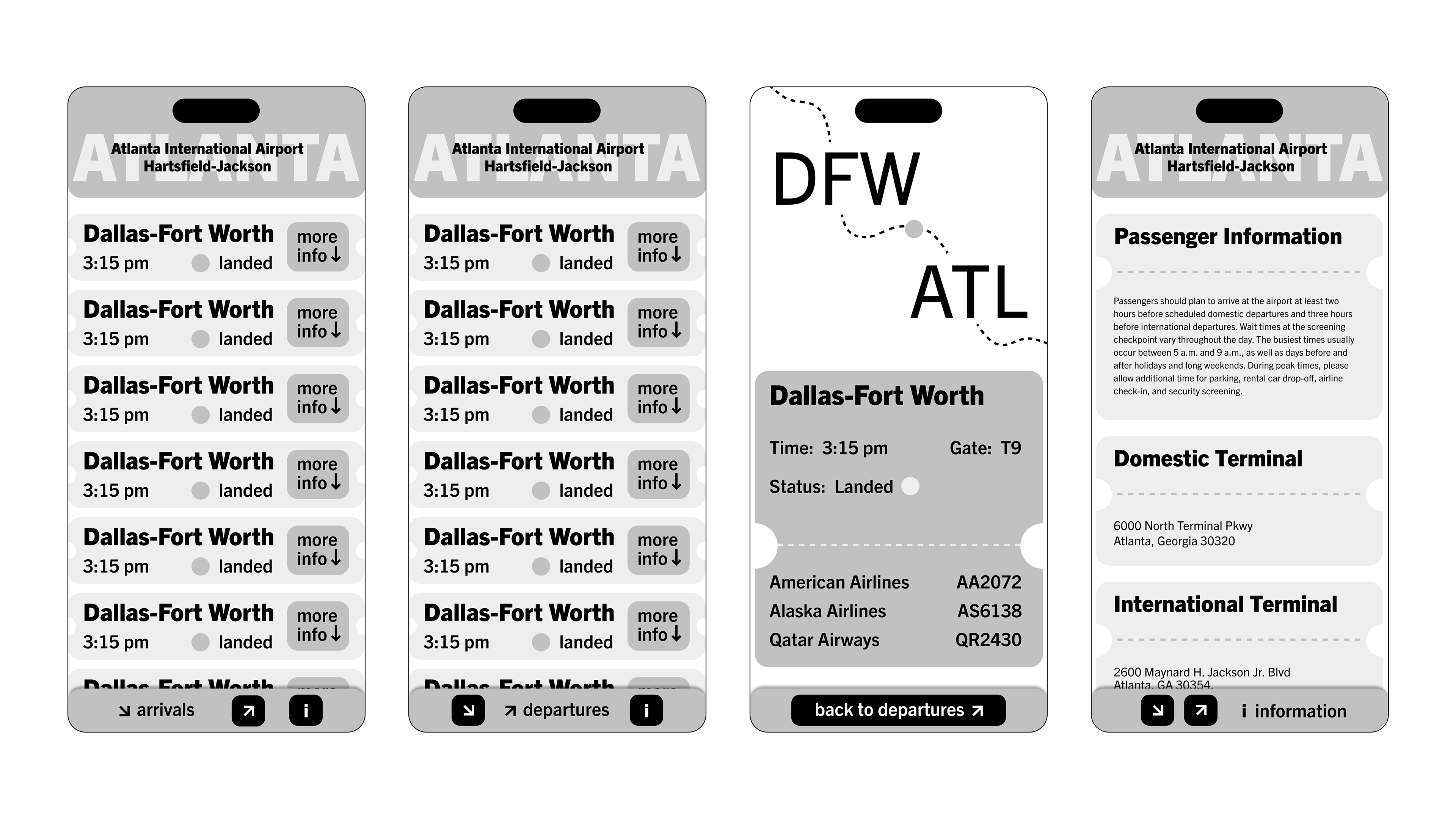
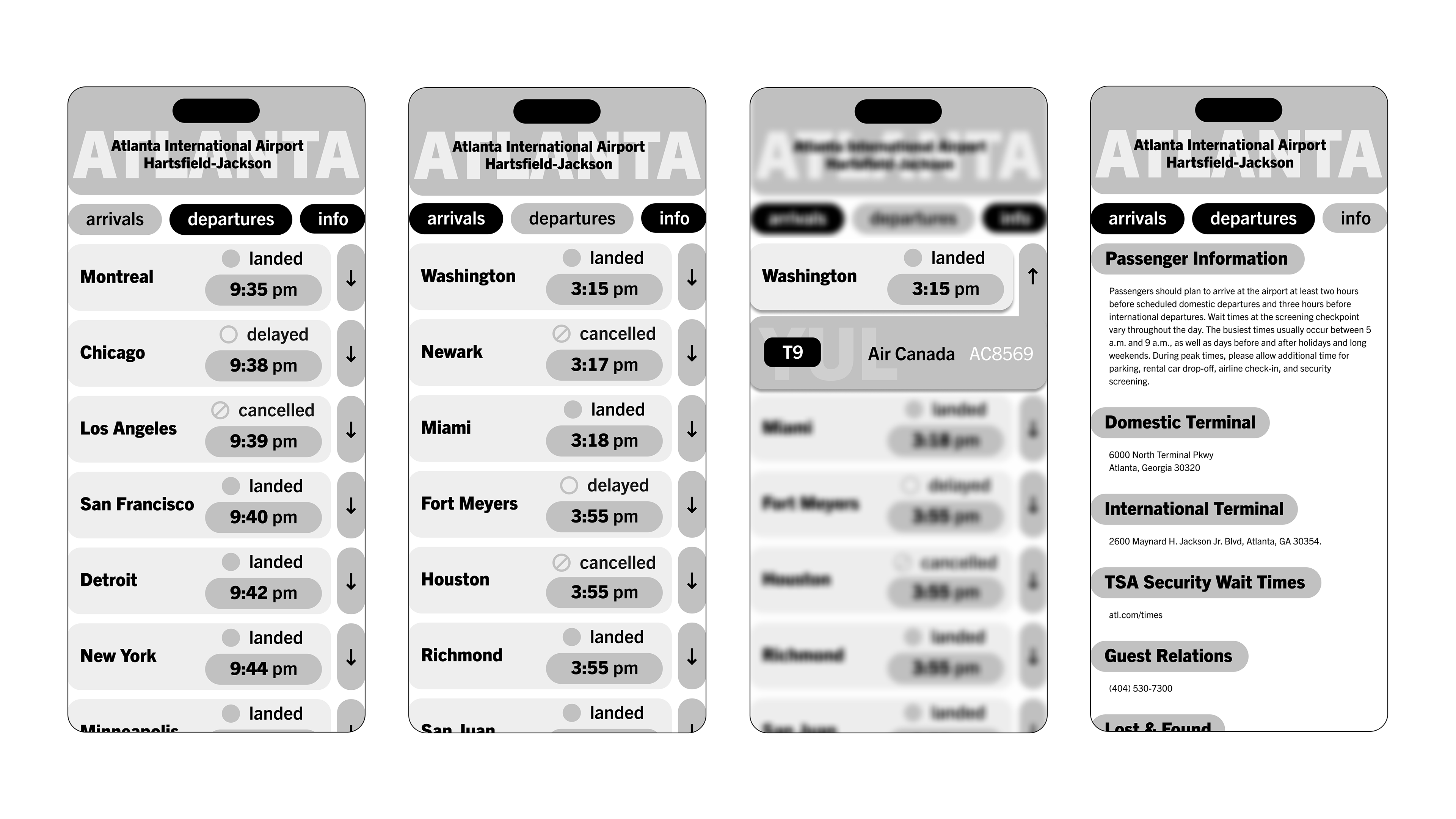
Grayscale Explorations
After several explorations of different interface layouts, the top two chosen were combined to become one, as seen in the final.
Elements from the detail screen on the left were integrated into the arrivals/departures layout on the right, and so was the modular setup of the passenger information screen.
Final Design
Prototype