Experimental Poster
Objective
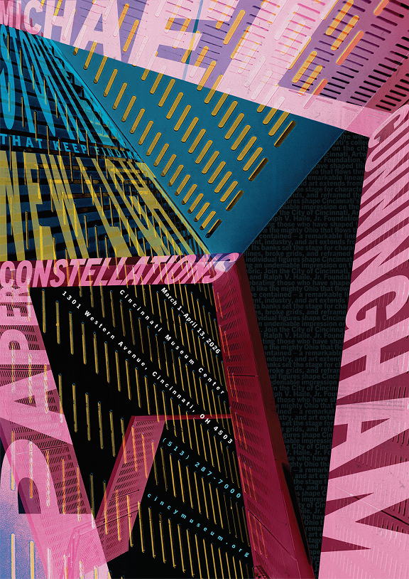
Design an event poster to promote and persuade an intended audience to attend an event. The poster will also communicate the meaning of a chosen person's work contribution.
Deliverable
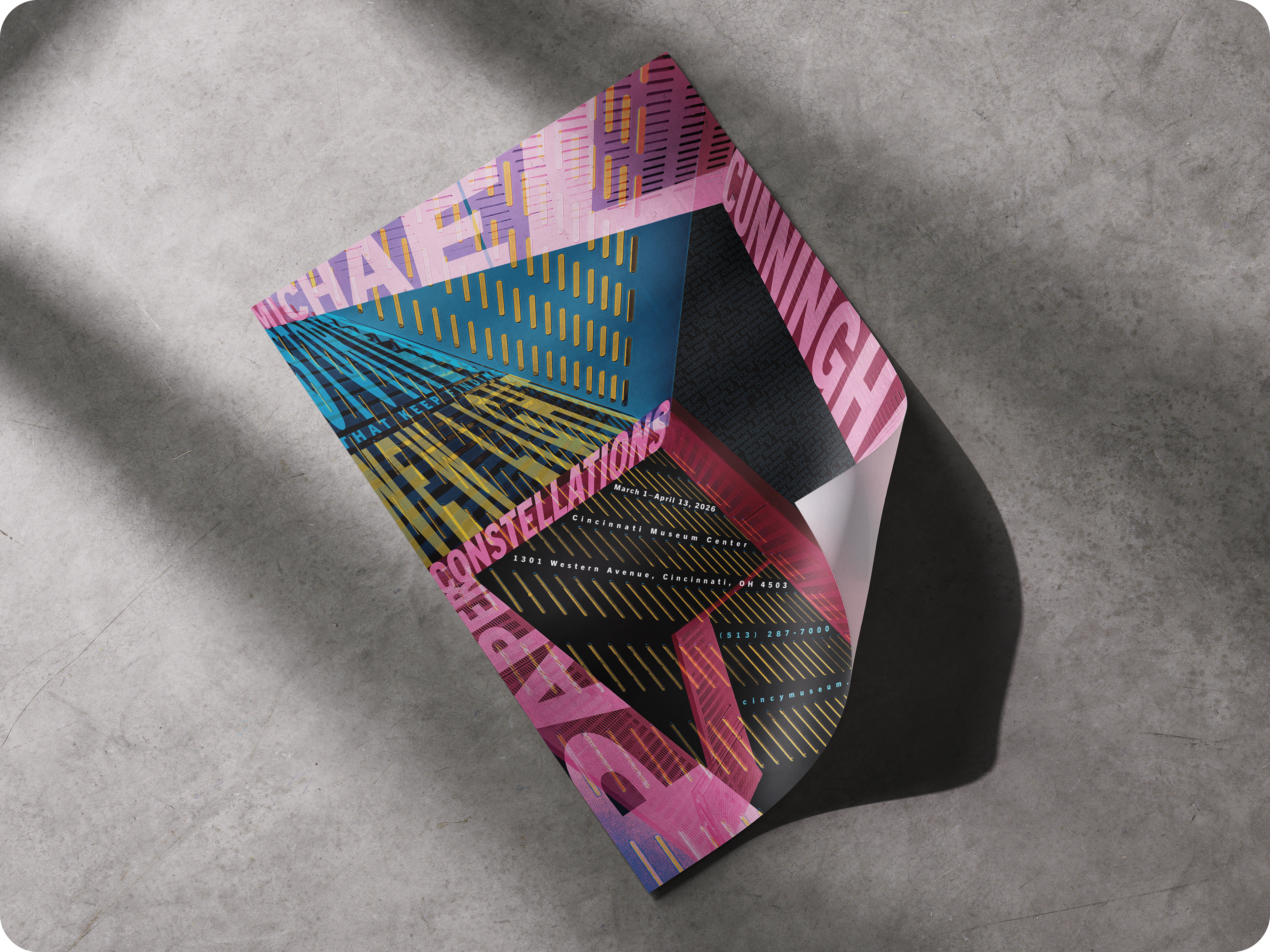
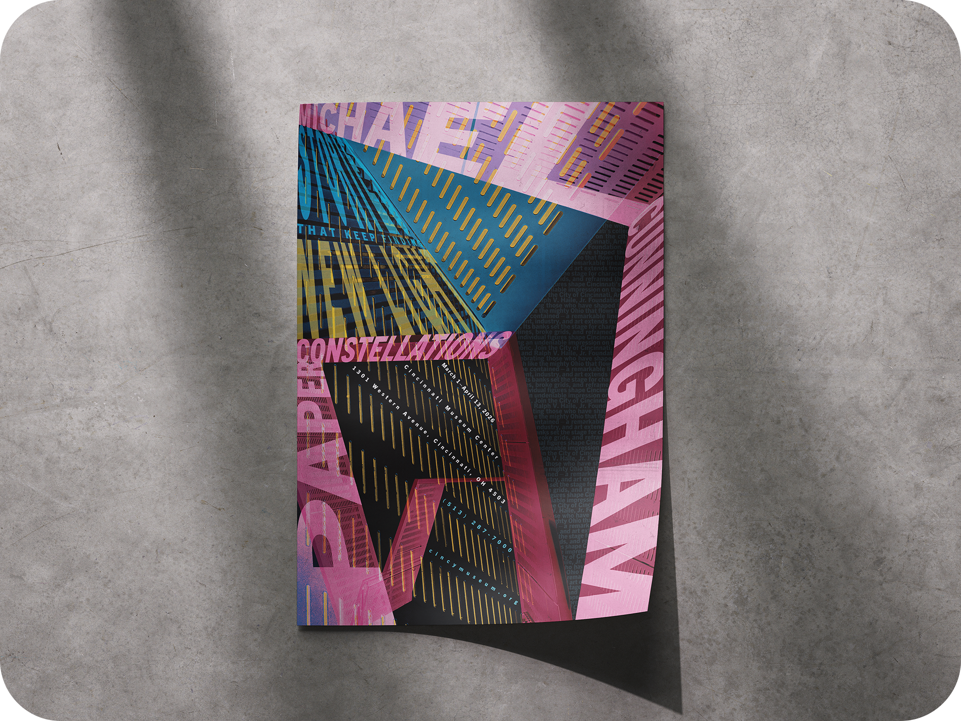
The goal is to create a 23.35" by 33" poster with the information for the event presented with a visually interesting and readable hierarchy.
Michael Cunningham
A Cincinnati-born, American novelist and screenwriter, well known for his novel The Hours, and several other works.
With a lot of paradoxes in his writing, Cunningham creates themes of light vs. dark, life vs. death, beauty vs. horror, etc. I wanted to capture those opposites in the final poster, with a lot of contrast in both the colors, as well as the typography.

Concept Sketches
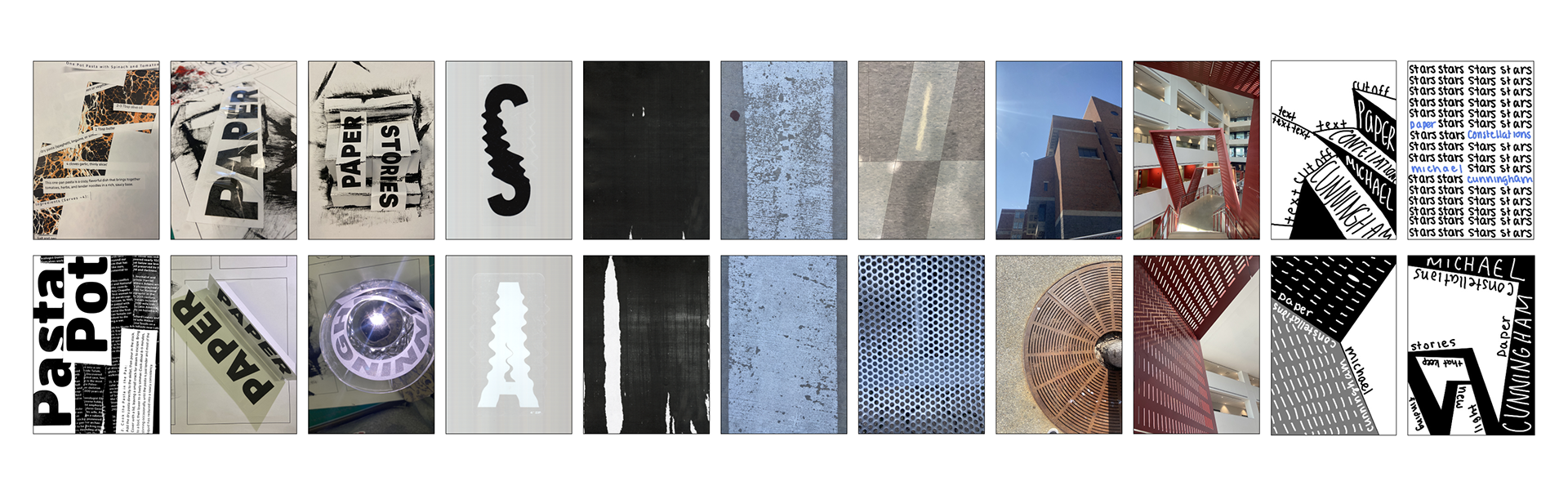
The first step after looking for benchmarks was to experiment with text and image through collaging, photographing textures and alternative grids, and sketching with these gathered elements.
Typeface & Color Studies
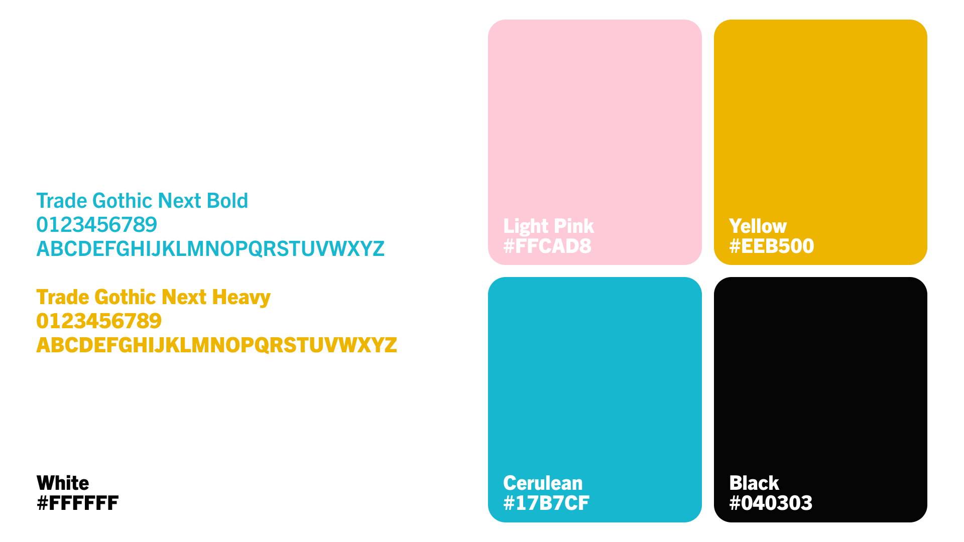
Trade Gothic Next was designed as a versatile, comprehensive, and cohesive sans serif typeface. A grotesque style with varied widths that are good for various designs.
This typeface was chosen for its simplicity and readability in bolder weights, with a modern and professional feel that is bold and readable from any distance a person may be reading it.
The final color pallet of white, black, pink, blue, and yellow were chosen to represent the paradox used in Cunningham's writing of beauty vs. horror, life vs. death, and light vs. dark with high contrast used in the editing of the final design.
Ideation Process
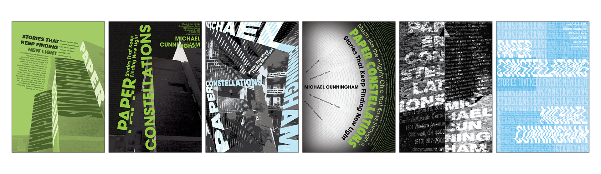
After experimenting with texture, alternative grids, collage, and sketching, the top six sketches were taken into Adobe Illustrator and Photoshop to create different compositions.
Iteration & Refinement
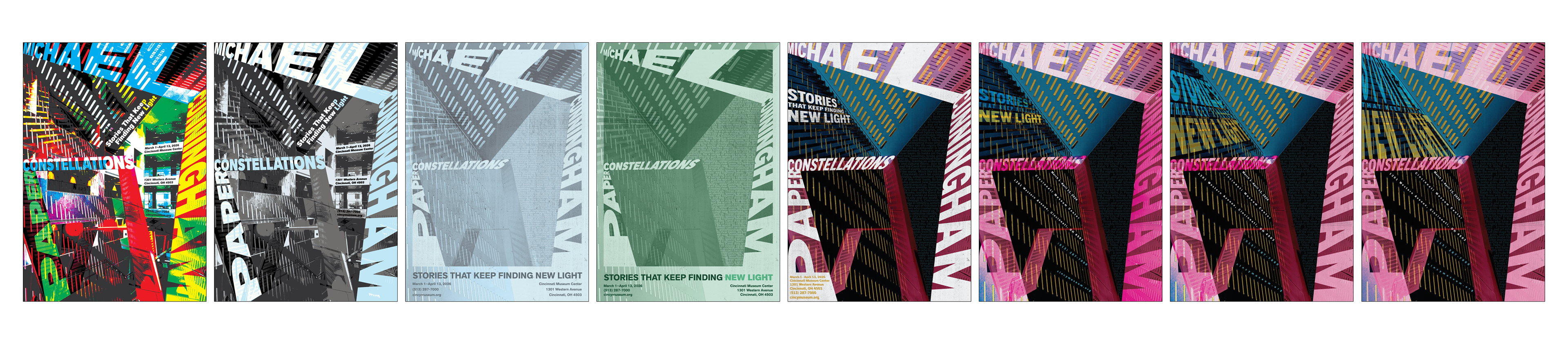
Of the six ideations, the top one was chosen to go through several refinements, leading to the final poster design.
Final Design